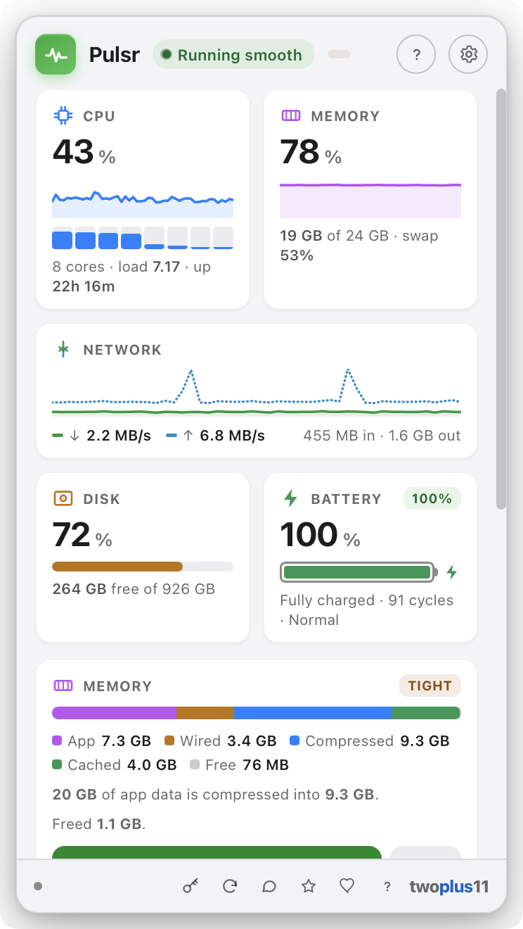
Every Mac already has an Activity Monitor. Almost nobody opens it, because a table of 400 processes doesn't tell you what to do. Pulsr does.
🧩
Every core, not just an average
A single "25%" reads the same whether the work is spread across every core or one core is pinned while the rest idle — and those are very different problems. Each core gets its own bar, with the efficiency cores drawn as the quieter half.
Per-core
💽
Every disk, not just the startup one
External drives are usually the ones that actually fill up, and they were invisible. Every volume you would see in the Finder sidebar now gets its own bar — and none of the synthetic system volumes macOS mounts behind your back.
Externals too
🌡️
A heat warning you can trust
Pulsr shows the reading macOS itself acts on, and only once it matters — the point where your Mac may be slowing itself down to cool off. No reverse-engineered sensor numbers that go wrong on every new Mac, and no permission prompts.
Quiet until it isn't
💬
"What's using your Mac," in plain English
The biggest hog gets called out in a sentence you don't have to decode — "Google Chrome is using the most memory right now — 2.3 GB across 31 processes." Processes are grouped per app, not scattered across dozens of PID rows, so the number matches how you actually think about your Mac.
The headline
📊
Live glyphs in the menu bar
CPU, memory, network, disk and battery as tiny live readouts, redrawn every couple of seconds. Show all of them or just the one you care about. The glyph is a template image, so it picks up your light or dark menu bar automatically — no configuration.
Always visible
🔤
Text or Graph, your call
Prefer numbers? Text style reads CPU 14% MEM 62% at a glance. Prefer shape over digits? Graph style draws a rolling sparkline per metric instead, so a spike is something you notice out of the corner of your eye.
Two styles
🖱️
Act on it without leaving
Every app in the ranked list has two buttons: bring it forward, or ask it to quit. Quitting is a normal, polite quit request — the app can still prompt you to save. System processes are labeled and have no quit button, so you can't take down the OS by mistake.
Two clicks
🧠
Memory, honestly
Used and free against your real total, plus swap when your Mac starts leaning on it. That's the pair that actually tells you whether you're low on RAM or genuinely under pressure — the distinction a single percentage hides.
Swap included
🌐
Network, up and down
Live throughput in both directions on one sparkline — download in green, upload dashed — with running session totals underneath. Handy for catching the backup, sync client, or update that quietly started saturating your connection.
Session totals
🔋
Battery health, not just charge
Charge level and time remaining, plus the numbers you'd otherwise dig out of System Information: cycle count, condition, and maximum capacity as a percentage of the day it left the factory.
Cycles · condition
💾
Disk before it bites you
Free space against total, with the card changing tone as the drive fills so "almost out of disk space" arrives as a warning rather than a failed save. Read and write throughput appear alongside it when there's room.
🩺
A friendly overall read
One pill at the top of the popover sums everything up the way a person would: Running smooth, Working hard, Under memory pressure, Almost out of disk space. Most days you look at that and close the window.
At a glance
🔒
100% on your Mac
Every reading is taken locally. Nothing about your system, your apps, or your activity ever leaves the machine — no account, no cloud, no telemetry, no history uploaded anywhere. The only network calls are the optional license check and update check.
Privacy
🪶
Stays out of the way
Pulsr runs as an accessory app: no Dock slot, no app-switcher entry, no window to manage. The popover tucks under the glyph and dismisses the moment you click away. Set the refresh interval to 1, 2, 3 or 5 seconds, and have it open at login.
Menu-bar native
🌗
Light and dark, properly
The whole popover follows your Mac's appearance, and every metric keeps its own Apple system hue in both — CPU blue, memory purple, network green, disk orange, battery green — so you learn the colors once and read the cards by shape after that.
🍎
Signed & notarized
Opens with a normal double-click — no "unidentified developer" warning, no Open Anyway, no Terminal. Signed with an Apple Developer ID and notarized by Apple. One universal build for Apple Silicon and Intel.
No warnings
♿
Built for everyone
Keyboard-navigable throughout, with VoiceOver labels and live announcements on the readings, honored Reduce Motion, and WCAG 2.1 AA contrast in both light and dark.
WCAG 2.1 AA
🌍
Speaks your language
Pulsr's interface comes in 13 languages, auto-detecting your Mac's language on first launch — switch it anytime from settings.
13 languages